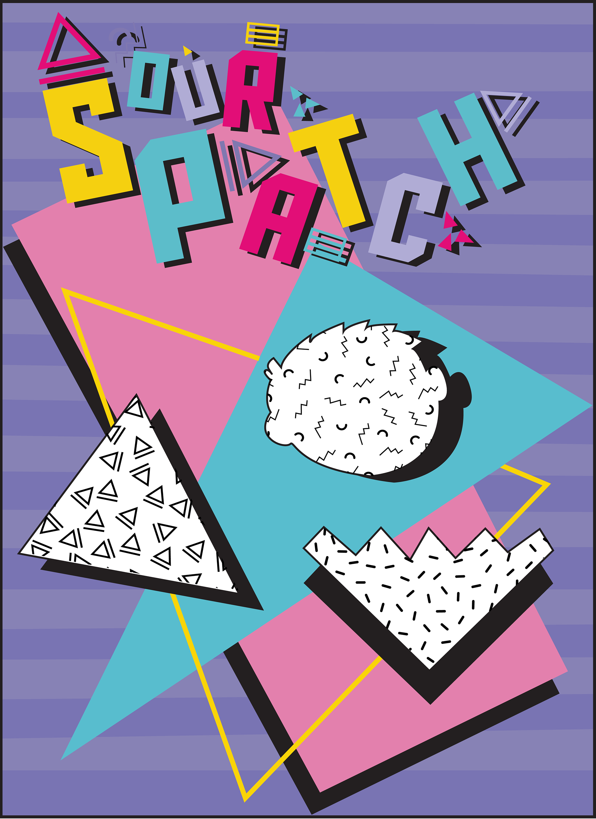
Reimagining of Sour Patch Kids with a 90s Memphis swag idea is a fun and playful take on the classic candy. Infusing the brand with the bold colors, patterns, and graphic design of the Memphis style, a unique and eye-catching aesthetic that is sure to stand out on store shelves and in the minds of consumers. The new logo for Sour Patch Kids incorporates the iconic silhouette of the candy, but with a fresh and modern twist. The bold, blocky finish, this typeface and vibrant colors are inspired by the Memphis movement, which gives the logo a distinctive 90s look and feel. This new logo is both fun and memorable, perfectly capturing the playful and irreverent spirit of the brand.
In addition to the logo, the poster design for Sour Patch Kids also incorporates the Memphis style with bold, geometric shapes and bright, contrasting colors. The design is lively and energetic, with a sense of fun that is sure to resonate with consumers. By incorporating this style into their branding, they have successfully modernized the classic candy while still retaining its nostalgic appeal.
Overall, their reimagining of Sour Patch Kids demonstrates a creative and thoughtful approach to branding and design. With a keen eye for aesthetics and a dedication to innovation, they are able to breathe new life into classic brands and create exciting, memorable experiences for consumers.